Visual identity for
ingredient partner
We were tasked with creating an ownable visual system to distinguish Ingredion from its global competitors in the B2B ingredient provider space. The campaign needed to fit seamlessly within the brand’s existing visual identity, while being pulled through all customer touchpoints (web, social, experiential, etc) to tell a wide variety of stories through a bold, unique identity.
Role: creative direction, photo retouching/color grading, mood boarding, brand identity guidelines, digital banners and social layouts, presentation design
The manifesto
Food providers need ingredient partners that decipher the complex consumer algorithm to offer solutions that customers want AND the great taste they’ll love. We know it’s not about giving you all the ANDs. It’s about giving you the right ANDs to make magic happen. The ANDs you want, and the ones you didn’t even know were possible. We’ve made it our mission to help you Own the AND.

The lockup
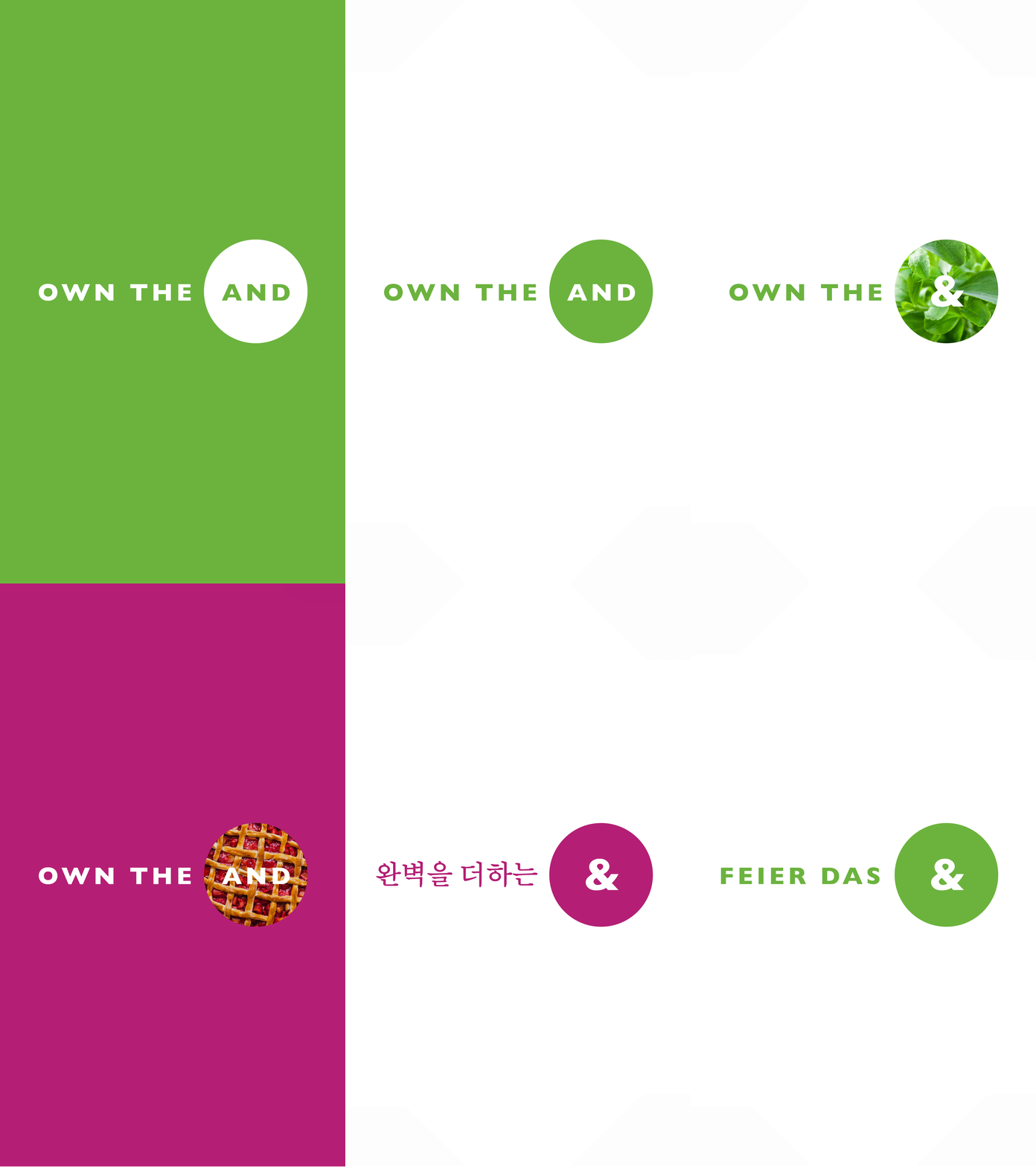
We were challenged to create a flexible wordmark that could adapt across international markets and live in a variety of places to tell dynamic stories in infinite ways. We chose to work with both the ampersand ‘&’, as well as ‘and’ for different copy and visual applications. The brand’s circle element was brought in as a container for the ‘and’, which could be layered on bold and graphic brand colors or color-matched photography as a texture.
Applications


Credits
ECD: Marc Dionne
CD, Design: Angad Medi
CD, CW: Mike Calderwood
CW: Jake Pacheco
AD: Laura Henschel
